Building Choropleth Maps Without Writing a Single Line of Code
Colour-filled boundary maps communicate data distributions instantly. MapAI generates them from a single descriptive query, no scripting required.
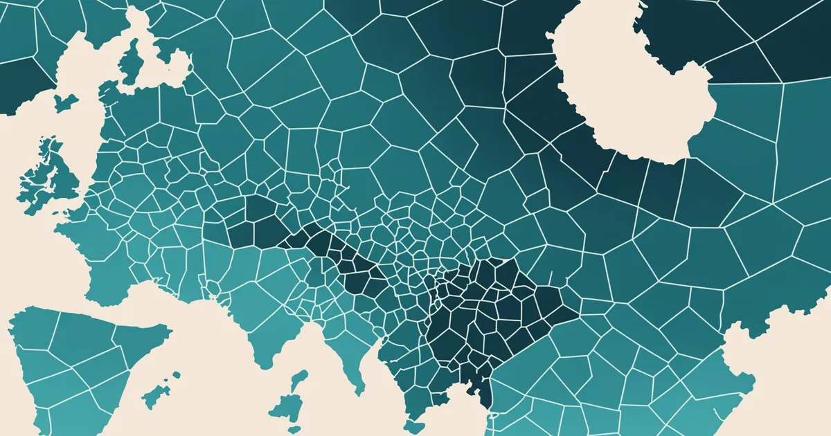
Choropleth maps are the most effective way to communicate how a measured value varies across a geographic area. Population density by suburb. Average income by postcode. Defect rate by delivery zone. Median property value by local government area. The moment you colour-code a boundary layer by a numeric variable, geographic patterns that were invisible in a spreadsheet become immediately legible.
The problem has always been that producing one requires either a GIS tool, a data visualisation library like D3 or Leaflet, or a platform that expects you to upload data in exactly the right format and map it to predefined variables. For analysts who work with location data but do not have a scripting background, choropleth creation has historically sat in the "ask someone who can code" category.
We built choropleth generation into MapAI from a single descriptive query, and this article explains what that means in practice, where it works well, and where the limitations sit.
What a choropleth query looks like
The short answer is that it looks like the question you would ask a colleague. "Show a choropleth of average household income by suburb for greater Melbourne." "Colour postcodes by their proportion of residents aged over 65." "Map census collection districts by dwelling density across inner Brisbane."
The system parses the geographic boundary layer (suburb, postcode, census collection district), identifies the variable to be mapped (income, age proportion, dwelling density), sources or accepts that data, and renders the output as a colour-filled boundary map using a sequential colour scale. No scripting, no data joins, no projection configuration.
For data that MapAI already has access to through connected Australian Bureau of Statistics and PSMA datasets, the query resolves fully from the natural language input. For data that is specific to your organisation (your own customer counts by postcode, your own delivery metrics by zone), you upload the tabular data and then query it: "Choropleth of our delivery volume by postcode for the eastern region."
The technical work that happens invisibly
A choropleth is deceptively simple visually but involves several technical steps that are easy to get wrong. Understanding what happens behind the query helps explain why getting it right has historically required specialist knowledge.
First, boundary alignment. The tabular data (income by postcode) has to be joined to the spatial boundary data (postcode polygons) on a common identifier. Postcode identifiers are not always consistent across datasets, particularly in Australia where Australia Post postcodes and the ABS Postal Area SA1 correspondence files use different codes. Mismatched joins produce silent errors: boundaries that appear on the map but have no data, or boundaries that are excluded.
Second, classification scheme selection. Choropleth colours need to be assigned to value ranges, and how you define those ranges changes what the map communicates. Equal intervals, quantiles, natural breaks (Jenks), and standard deviations are all defensible classification methods, but they produce visually very different maps from the same dataset. An analyst who does not know the difference may produce a map that emphasises the wrong pattern.
Third, colour scale selection. Sequential scales work for single-variable data where values range from low to high. Diverging scales work for data with a meaningful centre point (e.g., population change where negative and positive are both meaningful). Using a sequential scale on diverging data obscures half the story.
MapAI handles boundary alignment automatically using the standard Australian boundary correspondence files. It selects classification scheme based on the data distribution (defaulting to quantiles for skewed distributions, natural breaks for normally distributed data), and the colour scale is chosen based on whether the variable has a meaningful centre point. You can override any of these choices explicitly in a follow-up query, but the defaults are correct for the majority of cases.
A practical example: service equity analysis for a regional health network
Consider a health analyst at a regional network reviewing the distribution of allied health services across their catchment area. They have a spreadsheet of service delivery counts by SA2 boundary, and they want to understand whether the geographic distribution aligns with population need.
The initial query: "Choropleth of our allied health service contacts per 1000 population by SA2 for the Gippsland region." The system accepts the uploaded data, joins it to the SA2 boundary layer, calculates the per-capita rate using the ABS population figures it already holds, and renders the choropleth.
The analyst sees immediately that three SA2 areas in the eastern part of the region have very low service rates relative to their population. Follow-up: "Overlay drive-time access to our nearest service sites on the same map." The system adds a drive-time access layer. The combination reveals that the low-service areas are not just distant from existing sites, they are poorly connected by roads. That is a finding the analyst could not have reached quickly without both layers visible simultaneously.
The whole sequence took about four minutes. It would have taken at minimum two days through a conventional GIS workflow, assuming data access and a specialist were available.
Where choropleth queries have limits
We want to be clear about what natural language choropleth generation does not do.
It works well for standard Australian geographic boundaries: states, local government areas, SA1 through SA4, postcodes, suburbs. It works for data that can be mapped at those boundary levels. It works for the ABS data layers that MapAI has access to, and for your own tabular data once it is uploaded.
It does not work for custom boundary geometries unless you upload those boundaries as a GeoJSON or Shapefile. It does not perform cartographic polish at the level of a professional cartographer's output. The classification and scale defaults are statistically defensible but are not hand-tuned for publication-quality presentation. For internal analysis, briefing documents, and operational decision-making, the output is fit for purpose. For a journal submission or a public-facing report requiring full cartographic treatment, you would want to export the data and apply additional styling.
The honest framing is this: MapAI makes choropleth analysis accessible to people who could never produce one themselves, and produces output that is analytically correct and communicatively effective. It does not replace the judgement of an experienced cartographer working on a complex publication project. Those are different use cases, and they call for different tools.
Exporting and using your choropleth output
Once a choropleth is rendered, you can export it as a PNG for immediate use in a presentation, or export the underlying classified data as a GeoJSON for use in other tools. The Team plan also supports CSV export of the joined and classified dataset, which is useful when you want to do further analysis in Excel or another environment before finalising the visualisation.
If you have a dataset where the geographic dimension is currently invisible, a choropleth is usually the fastest way to make it visible. Type the question. Get the map.
Try MapAI
Ask your own location question
Free plan includes 50 queries per month. No credit card, no GIS background needed.
Start Free