Finding Coverage Gaps With a Natural Language Query: A Field Services Example
A field services team asked MapAI to show them postcodes with demand but no technicians within 40 minutes. The answer came back as a map, not a pivot table.
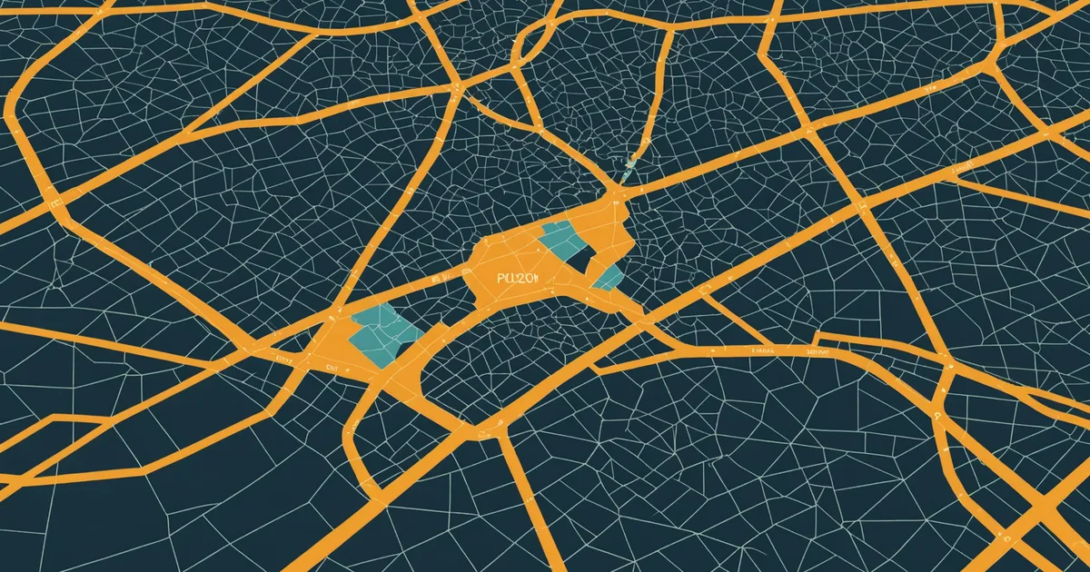
Coverage gap analysis is one of the clearest demonstrations of what geographic evidence can do for operational decision-making. The question is always some version of: where do we have demand, and where are we not present to serve it? The answer, when it is made visible on a map, tends to produce immediate clarity about where to act next.
The challenge is getting to that answer. Coverage gap analysis is operationally important but, in a conventional GIS workflow, technically involved. Identifying geographic areas with elevated demand but no service presence requires joining demand-side data to a boundary layer, generating service coverage zones from each existing service point, performing a spatial difference operation to identify demand zones outside all coverage areas, and filtering or classifying those zones by their demand level. None of those steps is conceptually difficult, but all of them require GIS tool knowledge to execute.
This article walks through a field services scenario that illustrates both the analysis type and the way natural language querying changes how teams can run it.
The field services coverage problem
A field services company with technicians distributed across southeast Queensland had a persistent operational problem. Customer demand was growing in certain areas, but response times in those areas were consistently above their service level targets. Their operations manager had a geographic intuition about where the problem was concentrated but had never been able to verify it with a map.
The question they brought to us during early access was specific: "Show postcodes where we have more than 10 service requests per month but no technician within 40 minutes drive." They wanted to see the geographic answer so they could decide where to recruit their next technicians.
The components of this question are three distinct spatial operations. The demand identification step requires aggregating service request records by postcode. The service coverage step requires calculating 40-minute drive-time catchments from each technician's home postcode. The gap identification step requires finding the postcodes that appear in the demand dataset but do not fall within any technician's catchment polygon.
In MapAI, the plain-English query was close to the question as stated. The system accepted the uploaded service request data (postcode and count columns), used the existing technician address list that had been uploaded earlier in the session, calculated the 40-minute drive-time catchments using road network data, and identified the demand postcodes that fell outside all catchment polygons. The result was a map of coverage gaps ranked by service volume.
What the map revealed
The map produced two findings that the operations manager had not anticipated from their intuition alone.
The first was geographic. The coverage gaps were not uniformly distributed across the region. They were concentrated along a corridor in the outer northwest, in postcodes that had been growing faster than the surrounding area. The operations manager had mentally attributed the slow response times to traffic on arterial roads, which is a reasonable assumption in southeast Queensland. The map revealed that the underlying cause was coverage geometry: the relevant postcodes fell at the intersection of multiple technicians' outer edges, where drive time from any single technician was at or beyond the 40-minute threshold.
The second finding was about scale. Three postcodes accounted for around 40% of the total demand volume in the coverage gap. Placing one technician in a central location relative to those three postcodes would close the majority of the gap. That is a hiring and location decision, not just a routing adjustment.
Both findings came from the same analysis. Neither was visible in the tabular service data without the geographic context.
The follow-up queries
Coverage gap analysis almost always generates follow-up questions, and the value of the analysis depends on being able to iterate quickly.
After seeing the initial gap map, the operations manager asked: "What is the current average drive time from the nearest technician to those three high-demand postcodes?" The system computed average drive time from the nearest technician address to the centroid of each postcode. The answer ranged from 48 to 55 minutes, confirming the coverage geometry problem.
The next query: "If we added a technician in postcode 4503, how much of the current gap demand would fall within 40 minutes?" The system recalculated the coverage analysis with a hypothetical technician in the specified location. The answer showed that approximately 62% of the current gap demand would be covered. That is the kind of sensitivity analysis that normally requires a consultant engagement. In this session, it came back in under a minute.
This iterative query pattern is where natural language geographic analysis produces its most distinctive value. The first query identifies the problem. The follow-up queries explore the solution space. When each follow-up costs seconds rather than days, the analytical process goes deeper before it converges on a recommendation.
Generalising the coverage gap pattern
The field services scenario above is one instantiation of a pattern that appears across many operational contexts. The underlying geographic question is always: where do we have a presence gap relative to demand?
In logistics, it is delivery coverage: which delivery zones have order density that justifies a new depot, and which are currently underserved by the existing network? In healthcare, it is service access: which communities have high need indicators but are further than a reasonable travel time from the nearest facility? In retail, it is network coverage: which high-density residential areas fall outside the catchment radius of any existing store?
Each of these is structurally the same problem: join demand data to a boundary layer, generate coverage zones from supply points, find the demand areas not covered. The specific datasets differ, the specific distance thresholds differ, and the specific business logic differs. The spatial operation is the same.
Natural language querying handles the structural pattern regardless of the specific domain. The analyst provides the context (field services, logistics, health, retail) and the specific parameters (40 minutes, 10 requests per month, no technician). The system handles the spatial operation.
What coverage gap analysis does not tell you
Coverage gap analysis tells you where a gap exists and how large it is. It does not tell you whether filling that gap is the right business decision.
Geographic evidence is one input into an operational decision. The decision also involves cost (what does it cost to place a technician or depot in a new location?), strategic priority (is growth in this region aligned with the company's direction?), feasibility (are there qualified technicians available in the relevant area?), and risk (what is the demand volume reliable enough to justify the fixed cost of a new presence?). None of those factors is spatial, and none of them is answered by a coverage gap map.
The map answers the geographic question. The decision requires the geographic answer plus the operational context that the people in the business already hold. That division of labour is the right one. Coverage gap analysis is a tool for making the geographic dimension of operational decisions visible. What you do with that visibility is still a judgment call.
Try MapAI
Ask your own location question
Free plan includes 50 queries per month. No credit card, no GIS background needed.
Start Free